Confetti in cross stitch means isolated single stitches or tiny clusters that sit away from larger blocks of the same color. Sometimes that confetti is doing real work. Think stars, eye highlights, snow, or the small shade changes that keep a pet portrait from looking flat. Sometimes it is just chart noise, especially in rough photo conversions.
That distinction matters. A little useful confetti can make a design look alive. A chart full of random one-off colors can turn a relaxing project into constant rethreading, recounting, and second-guessing. If the confetti is intentional, keep it. If it is not, fix the chart before you commit to it.
| If the confetti looks like this | It usually means | What to do |
|---|---|---|
| Stars, snow, eye sparkle, whiskers | Intentional detail | Keep it |
| Single weird colors that appear only a few times | Bad conversion or sloppy cleanup | Merge or remove it |
| Speckling across whole sections of a photo chart | Too many colors or dithering | Rebuild the pattern with fewer colors |
What is confetti in cross stitch?
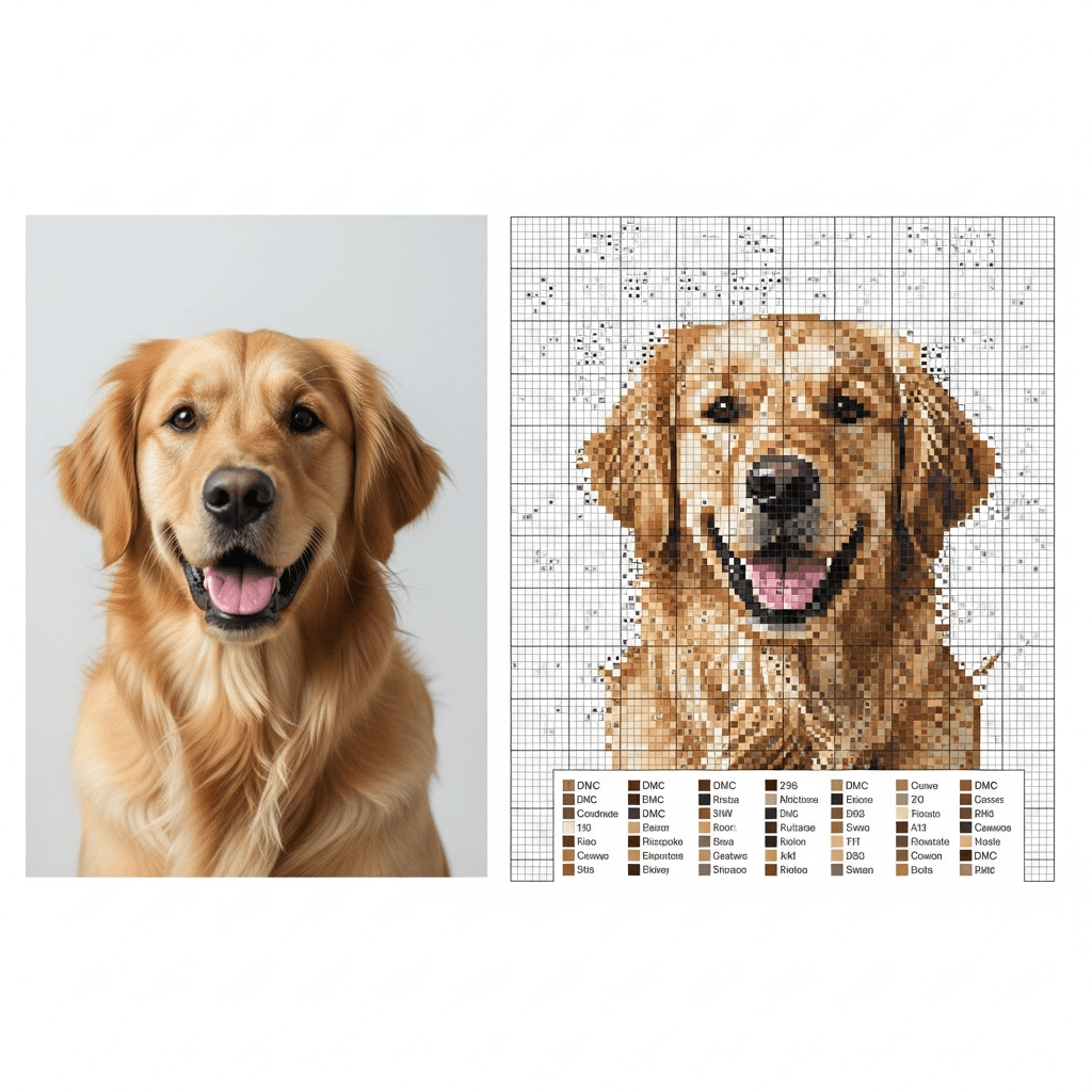
Caterpillar Cross Stitch's confetti guide defines confetti stitches as single stitches surrounded by blank fabric rather than more stitches of the same color. That is the clean definition. In practice, most stitchers use "confetti" a little more broadly. They also mean those annoying pockets where you have 12 colors in a tiny area and every one of them only gets a stitch or two.
The problem is not just visual clutter on the chart. It is the start-stop rhythm. Confetti gives you fewer places to bury thread ends, more chances to miscount, and more floss changes per hour. That is why beginners dread it.
It is also why raw photo conversions get such a bad reputation. DMC's six-strand embroidery floss line comes in 500 shades, which sounds generous until you remember your source photo has millions of colors. Every converter has to throw away information. If it does that badly, you get lonely stitches in colors that barely belong there.
Does lots of confetti always mean a bad pattern?
No. It can mean the pattern is trying to preserve real detail.
Thread Bare's chart-design guide points out that reducing an image to thread always involves tradeoffs between detail, palette size, and stitchability. Realistic fur, soft skin shading, or scattered lights in a night sky will naturally create some isolated stitches. That is normal.
The bad version is easier to spot than people think. In a recent r/CrossStitch thread about pattern quality, one of the better rules of thumb was this: question single stitches in colors that make no sense in that area, especially if that color only appears a handful of times across the whole chart. A white stitch in an eye highlight? Fine. A random pink stitch buried in brown dog fur? Probably junk.
That is the line I use:
- Keep confetti that creates a visible detail.
- Cut confetti that only proves the software found one more color.
If you want a fast gut check, open the legend and sort by stitch count. Colors with one to five stitches deserve scrutiny. Not automatic deletion. Scrutiny.
How do you fix confetti before you start stitching?
Start with the chart, not the needle. It is much easier to clean up ten bad colors in software than it is to fight them for three months on fabric.
Lower the color count first
This is the fastest fix because too much confetti often comes from too many nearly-identical shades. Thread Bare says many converted images still look great in the 30 to 70 color range, and the difference does not get dramatic until you push much lower. For hobby photo charts, I would start even tighter than that. Usually 25 to 35 colors is plenty unless you are intentionally chasing a very detailed full-coverage piece.
If your modest-size chart is asking for 58 colors, cut it back by five or ten and look again. You will usually lose less detail than you expect and a lot more nonsense than you thought.
Turn dithering off when the chart looks like static
Dithering is one of the biggest confetti factories. Thread Bare's examples show why: dithering makes gradients look smoother on screen by alternating nearby colors, but that also creates more speckling in the chart. Good for digital realism. Rough on the person actually stitching it.
If you are making a gift, a pet portrait, or anything you want to enjoy finishing, I would rather accept slightly firmer color transitions than stitch a page that looks like TV snow. Turn dithering off, or at least compare both versions before you commit.
Merge one-off shades that do no real work
Open the legend and look for colors with tiny stitch counts. If a shade only appears twice and those stitches are not carrying a highlight, shadow edge, or intentional sparkle, merge it into the nearest neighboring color.
This is where the DMC floss color matching guide helps. If you are choosing between two close greys or browns, stay inside the same color family instead of grabbing whatever looks close on your screen.
If you are generating from a photo instead of buying a finished pattern, this is also the point of using a tool that lets you adjust palette size and clean isolated stitches before export. StitchLark is built around that part of the workflow. The math is not the fun part, so let the software do it before you spend your own time cleaning the chart by hand.
How do you stitch confetti without making a mess?
Once the chart is worth stitching, the job changes. Now you need a way to anchor single stitches cleanly and keep your counting under control.
Use a loop start or pin stitch
Caterpillar Cross Stitch recommends a loop start when you are stitching with an even number of strands and a pin stitch when you are using an odd number. That matches real life. A loop start is clean and fast when you can use it. A pin stitch is the bailout tool for those lonely stitches with nowhere obvious to hide the tail.
Better Cross Stitch Patterns' pin stitch tutorial is useful here because it explains the actual problem: confetti often leaves you with no surrounding stitches to bury the ends under. If you have been avoiding confetti because you hate messy backs, learn the pin stitch once. It is worth the trouble.
Keep thread carries short
Caterpillar's guide recommends keeping carries under four to five squares. That is a good ceiling. Longer carries show through light fabric, catch on the back, and make isolated areas harder to read later.
If the next stitch in that color is six or eight squares away, end the thread and restart. Yes, it is slower. It is still better than stitching a shadow you can see from the front because you tried to save 20 seconds.
Grid the area and work smaller blocks
Confetti punishes sloppy counting. Grid lines help. So does shrinking your work area.
Caterpillar suggests working in 10 by 10 sections for confetti-heavy areas, and I agree. You do not need to finish an entire page in one pass. Work a square, complete the nearby colors, and move on. That is much easier than scattering random singles across a whole page and trying to find them again two nights later.
Should you stitch confetti first or last?
There is no sacred answer, which is why stitchers keep arguing about it.
In Caterpillar's FAQ, they say either approach works. A Reddit thread on confetti order landed in basically the same place. Some stitchers prefer confetti first so surrounding stitches secure the thread and cover longer jumps. Others prefer it last because the filled area makes counting easier and gives them more places to anchor.
My rule is simple:
- Stitch confetti first when it sits inside a block that will soon surround it.
- Stitch confetti last when the area is easy to miscount or the nearby stitches will help you anchor cleanly.
What I would not do is scatter isolated stitches across a whole page and promise yourself you will sort it out later. That is how you end up with mystery holes and a lot of swearing.
When should you leave confetti alone?
Leave it alone when removing it would flatten the design.
That usually means:
- catchlights in eyes
- stars and snow
- little shifts in animal fur
- metallic sparkle
- painterly texture that you actually like
The Art of Stitch says their charts are refined by hand to remove unnecessary confetti. That word matters: unnecessary. Not all confetti is the enemy. The goal is not zero confetti. The goal is confetti that earns its place.
Your next step
Pull up one chart today and audit it before you stitch another page. Look for colors that appear five times or fewer. If those stitches are not doing obvious visual work, merge them or rebuild the pattern with fewer colors and less dithering. If the chart came from a photo conversion, how to turn a photo into a cross stitch pattern walks through the setup that prevents most of this mess in the first place.
If you would rather start from a cleaner draft, run the image through StitchLark's photo-to-pattern tool, clean the palette before export, and make the pattern better while it is still cheap to change.