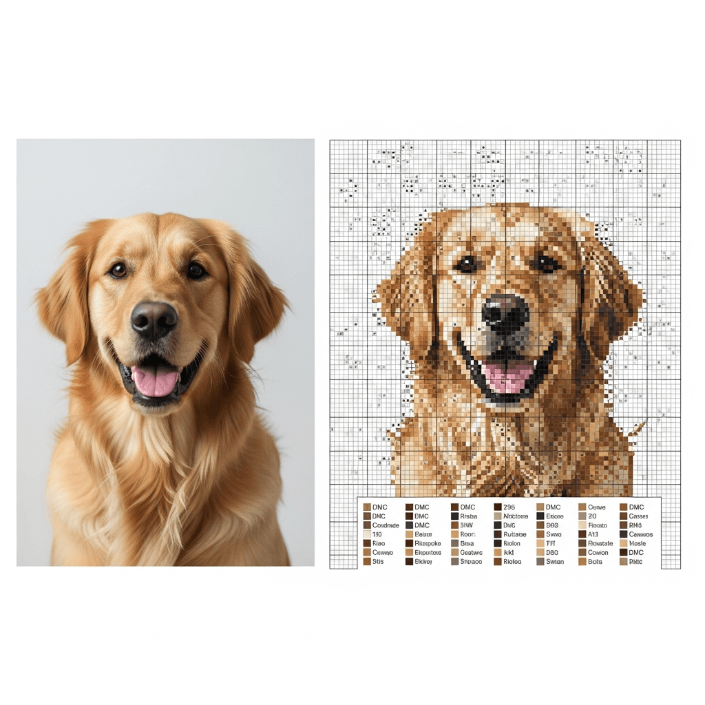
You upload your favorite photo, hit "convert," and the software spits out a pattern with 87 colors and hundreds of random single stitches scattered everywhere. You've just met confetti, and it's the reason most photo-to-pattern projects end up stuffed in a drawer after page two of the chart.
If you landed here after fighting with an older converter, the most common culprit is still Pic2Pat-style output with too many isolated stitches. The full StitchLark vs Pic2Pat comparison breaks down what changes when you want cleaner, more editable results.
The fix isn't complicated. You need to prep your photo before conversion, limit your color palette, turn off dithering, and clean up the leftovers. Do those four things and you'll get a pattern that looks like your photo and is actually stitchable.
Here's exactly how.
Start with the right photo
Not every photo converts well. The ones that work share three traits: a clear subject, a simple background, and good lighting. A portrait of your dog sitting on a solid-colored couch? Great. A group shot at a crowded restaurant with neon signs behind everyone? That's going to be a nightmare of confetti no matter what tool you use.
Before you even open a pattern converter, crop your image tight. Cut away everything that isn't the subject. If you're doing a pet portrait, frame from the ears to just below the chin. That busy bookshelf behind them? Gone. Every extra detail in the background becomes more colors and more scattered stitches in the final pattern.
Bump the contrast up slightly. This helps the converter see cleaner edges between your subject and the background, which means fewer awkward color transitions. You don't need Photoshop for this. The built-in editor on your phone works fine.
What confetti actually is (and why converters create it)
Confetti is the cross stitch term for isolated single stitches that don't connect to anything. One random blue stitch surrounded by a block of cream. One dark green stitch floating in the middle of a light green area. They look fine zoomed out on a screen, but stitching them is miserable. You're constantly changing thread for a single stitch, then switching back.
Converters create confetti for two reasons.
Too many colors. When you let a converter auto-select colors from a photo, it might pull 60, 80, or even 100+ DMC shades. The more colors in the palette, the more places where two similar-but-different shades end up next to each other as isolated stitches. Your eyes can't even tell DMC 3799 (very dark pewter grey) from DMC 413 (dark pewter grey) in the finished piece, but the software treats them as different, so you get confetti.
Dithering. This is the big one. Dithering is a technique software uses to fake color gradients by scattering pixels of two different colors in an alternating pattern. In digital images, it looks smooth. In cross stitch, it looks like someone threw a handful of colored sprinkles at your fabric. Dithering is the single biggest cause of confetti in converted patterns, according to Thread Bare's guide to chart design.
How many colors should you actually use?
This depends on your image and your patience, but here's a practical breakdown:
- 15-25 colors for your first photo conversion. Enough to get good shading and detail without drowning in floss skeins.
- 25-35 colors for most portraits and scenic photos. This is the sweet spot where the pattern still looks like the photo but is genuinely enjoyable to stitch.
- 40-60 colors if you want near-photorealistic detail and you're an experienced stitcher who doesn't mind complexity.
Start lower than you think you need. You can always bump the count up by 5 and re-convert. Going the other direction (cutting 15 colors out of a 60-color pattern after you've already started stitching) isn't an option.
The conversion process, step by step
1. Edit your photo first
Crop it tight. Increase contrast slightly. If the background is busy, blur it or replace it with a solid color. These three minutes of editing will save you hours of cleanup on the pattern side.
2. Upload and set your dimensions
Every converter asks you to set the stitch count (width x height). This determines the physical size of your finished piece based on your fabric count. On 14-count Aida (the most common for beginners), 140 stitches across = 10 inches of fabric.
For a first project, aim for something in the 100-150 stitch range on the longest side. Big enough to capture detail, small enough to finish without losing motivation.
3. Limit your color palette
Set the max color count before you hit convert. Start at 25 and see how the preview looks. If it's muddy, bump to 30. If it's still clear at 20, go with 20. Fewer colors = less confetti = more fun.
4. Turn off dithering
If your converter has a dithering option, turn it off. Floyd-Steinberg dithering, ordered dithering, error diffusion — whatever the setting is called, disable it. You lose a tiny bit of gradient smoothness and gain a massively more stitchable pattern.
Some tools don't let you control dithering directly. If yours doesn't, reducing the color count aggressively has a similar effect because there aren't enough colors left for the algorithm to scatter.
5. Clean up the pattern
Even with the right settings, you'll get some stray stitches. Open the pattern in your editor and scan for isolated single stitches. Replace each one with the color of its nearest neighbor. Most pattern editors let you do this stitch by stitch, or you can use a dedicated confetti removal tool if your software has one.
StitchLark has a one-click confetti cleanup that identifies isolated stitches across your entire pattern and recolors them to match their surroundings. You can also use the brush tool to manually clean specific areas where you want more control.
6. Merge similar colors
After cleanup, check your color list for near-duplicates. If you have DMC 310 (black) and DMC 3371 (black brown) and they only appear in small amounts, merge them into one. Every color you eliminate is one fewer thread to manage while stitching.
Which fabric count should you use?
The fabric count changes how detailed your pattern looks at a given physical size. Higher count = smaller stitches = more detail per inch.
| Fabric | Stitches per inch | Best for |
|---|---|---|
| 14-count Aida | 14 | Beginners, larger pieces, less eye strain |
| 16-count Aida | 16 | Good balance of detail and comfort |
| 18-count Aida | 18 | Detailed portraits, experienced stitchers |
| 28-count evenweave (over 2) | 14 | Same as 14-count Aida but on linen/evenweave |
For photo conversions, 16-count or 18-count generally gives you better results because you get more stitches packed into the same physical space, so gradients look smoother without needing as many colors.
How to pixelate a photo for cross stitch without software
If you want full control and don't mind a slower process, you can pixelate a photo manually in any image editor.
- Open the photo in your editor (GIMP, Photoshop, even Canva).
- Resize the image down to your target stitch count. For a 150 x 200 stitch pattern, resize to 150 x 200 pixels.
- Set the resampling method to "Nearest Neighbor" (this avoids introducing new blended colors).
- Reduce the color palette. In GIMP, go to Image > Mode > Indexed and set the max colors to your target.
- Zoom in. Each pixel now represents one stitch.
This gives you a pixelated version you can chart manually or feed into a pattern tool for DMC color matching.
Common mistakes that create confetti
Using the photo straight from your camera. Phone photos are huge (4000+ pixels wide) with millions of colors. The converter doesn't need that resolution. Resize to a reasonable stitch count first, or let the tool handle it.
Leaving dithering on "auto." Most converters default to some form of dithering because it makes the digital preview look better. It makes the stitching experience worse. Always check.
Not editing the background. If your subject is a cat and the background is a patterned rug, the converter is going to faithfully reproduce every color in that rug as isolated confetti stitches. Blur it, remove it, or replace it with a solid color.
Skipping the cleanup pass. Even with perfect settings, expect to spend 10-15 minutes cleaning stray stitches after conversion. It's the most boring step and the most impactful one. A clean pattern means you won't be cursing at yourself halfway through stitching when you have to change thread 40 times on a single row.
Can you legally sell a pattern made from a photo?
Short answer: it depends on the photo. If you took the photo yourself, you own the copyright and can sell patterns based on it. If the photo is someone else's work, you need their permission or a license that explicitly allows derivative works.
Stock photos with commercial licenses usually cover pattern creation, but read the specific terms. "Editorial use only" licenses do not allow you to sell derivative products.
Photos of copyrighted characters (Disney, etc.) are off-limits for commercial patterns regardless of who took the photo. The character design is separately copyrighted.
Your next step
Pick a simpler photo than you think you need. Pet portrait. Flower. Clear subject. Clean background. Crop it, boost the contrast, and run it through a converter with 25 colors and dithering turned off. Spend 10 minutes cleaning up the stray stitches. That short cleanup pass matters more than squeezing in five extra colors.
If you want to skip most of the cleanup, try StitchLark's photo-to-pattern flow. It handles the color matching, confetti removal, and DMC mapping in one pass, and you can judge the draft before you commit to the project.
